Thursday 29 March 2012

Evaluation

Question 5


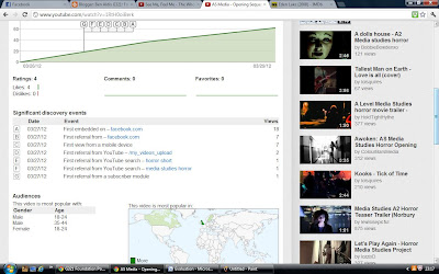
As soon as the editing was finished, the sequence was uploaded to youtube. The annotations explain how we intended to follow the codes and conventions of a slasher horror/thriller and how the sounds, camerawork and editing add to the suspense of the film.


These are the statistics of the video showing mobile device views, embed views, audiences and ratings so far.


The video has done quite well so far, considering it has only been on youtube for a few days.


The demographics show that the video has an audience of male and female 18
-24 year olds, exactly who we predicted the target audience would be. We have received 4 'likes' for the video and 70 views so far. There have been no dislikes or negative comments yet. We have hopefully met with the audiences expectations.
Evaluation

Question 3


A film distributor is the company who releases the film to the public. They send the film out to exhibitors and create ways to promote the film to attract as many people as possible. Distributors will make deals with others to show the film in different countries. 

StudioCanal UK (formerly Optimum Releasing/Home Entertainment/Classics) is a film distributor company working in the UK andIreland. The company releases many films, including foreign language films, anime releases such as Studio Ghibli's films and independentBritish, Irish and American films in the UK and sometimes Ireland.

Optimum was acquired by StudioCanal, a subsidiary of Vivendi SA, in 2006.[2] Since StudioCanal bought Optimum, the French company distribute their large back catalogue of classic British films (many from the Cannon and EMI catalogues) through Optimum releasing under the strand 'Optimum Classic'.

Source: http://en.wikipedia.org/wiki/Optimum_Releasing

Companies like Optimum Releasing would be ideal in distributing our film. They have distributed several low budget British films in the past including:
  • Attack the Block
  • Submarine
  • Brighton Rock


A film slightly similar to ours is "Eden Lake" (2008), a British horror film by James Watkins and distributed by Optimum Releasing. In the UK, it opened at 184 screens and grossed  £192,027 on its opening weekend and £481,710 overall. The film had a limited release in the United States, opening at 10 screens and making $5,824. 


Evaluation

Question 2


The left picture is the main antagonist from our film, and the right picture is Michael Myers from John Carpenters "Halloween" (1978). I have chosen these paticular images as the lay out is similar; a low angle shot of a masked killer holding their weapon.
Both characters are extremely similar in terms of costume and role.
They both disguise themselves wear pal masks which shadow out their eyes (signifying their insanity and inhumanity) The masks also seem to intensify their breathing; in both films their breathing can be heard unusually loudly.
They have the same choice of weapon -a large kitchen knife. We did consider more elaborate weapons such as axes and even pitchforks, but because of budget reasons and the weapons looking too obviously fake, something more simple had to be used.

Michael wears a dark green boiler suit while our killer dresses in a casual manner wearing a fleece and coat, obviously because of the cold weather. The ordinary clothes indicate he was once an ordinary member of society, making the idea more terrifying.
Their roles in the films are extremely similar, it is the typical slasher film antagonist; a silent psychotic stalker slaughtering people for no clear reason.
In terms of body language, they both stand upright and confidently since they feel no fear or intimidation from other characters.

This character is not made to represent any type of social group, but by his physical build the audience would assume that he is between the age of 15 and 19, so the film could be addressing the issue of teenage crime in Britain.

Tuesday 20 March 2012

Evaluation

"Fear"

Question 1


The Setting for our opening sequence is an isolated country park which is shown through the establishing shot. In the next shot our main characters are introduced, a young innocent couple, walking through the park. They are shown laughing with each other to establish that there is a warm relationship between them, and to show these are nice, friendly people causing the audience to identify with them and more importantly care about them. One thing I noticed in recent slasher films is that the main characters are often unlikable therefore the audience does not care a great deal what happens to them, such as Rob Zombie's "Halloween" (2007)

An isolated location and a young cast is a common convention for slasher horror films, it was necassary to have these to prove that we understood the conventions of a slasher film. In terms of technical aspects, such as camerawork, we used POV shots from the antagonist of the couple, with the accompanying sound of heavy breathing and one short take of the antagonist through the trees to keep mystery as to what the antagonist looks like, and what his motivation is; The antagonist is typically fully revealed towards the end of the film.

An isolated location is important as the environment surrounding the characters is quiet, with only ambient sounds being heard. This creates a calm and relaxing mood which is in contrast to the final moments of the scene, where one of the characters is brutally attacked. This sudden change, makes the scene more dramatic and shocking.

As the male is attacked and the girl presumably survives, then the film opens up a story about her and her attempt to find and kill the stalker for killing her boyfriend and before he kills anyone else. This relates to the"final girl" situation in slasher films where all other characters are killed off but one girl is left do destroy the antagonist such as Laurie Strode in Halloween, Nancy Thompson in A Nightmare on Elm Street and Alice Hardy in Friday the 13th.

The work of John Carpenter greatly inspired me when making this this film. I was pleased to be able to direct the sequence as well as compose the music, something that Carpenter does in the majority of his films.
We considered several aspects of his films, including:
  • POV shots
  • High key, minor piano/ low synthesized music
  • Never fully revealing the killer
  • The titles - white lettering, black background
  • Wide isolated locations (generally, Carpenter's films begin with open locations and gradually become smaller as the film progresses, until the effect becomes claustrophobic. In the case of "Halloween" (1978), the main character Laurie Strode (Jamie Lee Curtis) is introduced to us outside where she is walking to school. By the end of the film she is forced to lock herself inside a small closet, hiding from the antagonist, Michael Myers.
    Title sequences in Carpenters films are often always a plain background with relatively plain lettering. Notable examples include:

    But the film ours most resembles is "Prince of Darkness" (1987) where the story progresses as the screen cuts to black every 4-6 seconds showing 1 or 2 credits. However, in Prince of Darkness the credits go on for 9 minutes; we only showed the most important credits including main cast members, writer, music composer, editor and director. Other films tend to credit Director of Photography, Executive Producers, Associate Producers etc. however due the time limit of the sequence we could not fit more than 9 cuts to the credit sequence. 


    Tuesday 13 March 2012

    Update

    Lee has been editing the footage while I have been away and e-mailed me several drafts over the past few weeks. I am extremely pleased with the material so far. Some credits have been added and the original ending has been removed, which I think was a wise decision. I am disappointed that I could not be there for the start of post-production but am glad to be for the remainder. The footage only needs a few tweeks and a soundtrack which will hopefully be finished by 23rd March.


    I kept my titles simple as it seems to be a convention of the genre to have simple white text on a black background, with a fade in and out effect. I used Ariel Black font and they each last 4 seconds. I also used the soft focus effect again on these titles which loses effect in the middle, in the same way the film title does.


    This is my film title, shown 5 seconds into the movie. The text was created on Photoshop then imported to FinalCut. I then added 2 effects to the text, earthquake and soft focus, which simultaneously lose effect in the middle of it's duration to make the text clear to read. The clip is faded in and out to black to make the movie smooth, keeping with conventions of the genre.